Night at the Museum Tri 2 Blog
Personal Presentation Reflection
Considering my last trimester’s night at the museum project, I think this trimester’s was quite a considerable upgrade. While my project was not as extravagant as I originally intended, I am very proud of what I have to show for my overall CSP improvement over the last trimester. At the event, my part of the website did end up breaking in the part with the table including the charging times as the loop that I created to reveal all the charging times at once was not functioning correctly so that when I hit the button to reveal all the elements in the table at once. I also wanted to add some more formatting to that page with the charging time information to make it look better and more professional as well as for the main page with the Lucid information. Similarly, I wanted to make the grid in the game look more like a parking lot but was not able to get that done before the deadline.
My Night at the Museum Experience
During Night at the Museum this trimester, I mainly wondered around the two rooms used for CSP and CSA projects to see what other people did and compare it with ours. I also looked at other artwork (paintings) in the room next to the CSP room that looked like it was from one of those art classes. I was most intrigued by the projects in the Computer Animation room since I took that class and really enjoyed it last school year. In this classroom, I took pictures of their projects which I will be analyzing and critiquing.
Artwork 1

Analysis/Critique
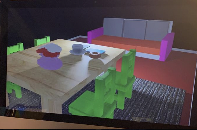
- This donut scene roots out from the previous projects in the computer animation class of simply just creating a donut which eventually students turn into this.
- This scene is very detailed with the couch cushions being imperfect, making it look more realistic, the textures to the table and carpet make it look very good as well
- The donut, coffee, table objects, and vase with flowers also look very nice visually in the scene with the bright lighting making it look good as well
- One criticism I have is with the chairs and couch since the bright colors don’t look like they would match up with the table, carpet, and floor
Artwork 2

Analysis/Critique
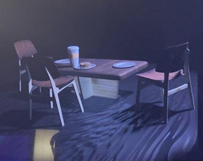
- This scene is similar to the last except it is even more detailed with the textures, shapes, objects etc.
- The darker on light wood texture gradients look very nice and work very well together in the scene since the chairs match the table
- The shape with the rounding on the chairs as well as the base of the table also look very nice and show clear effort from the creator
- The plates on the table as well as the very detailed coffee cup add to the simple scene
- One thing that I would do is add walls and maybe a little more lighting to the scene because on the edge of the floor, it looks like it just goes out into a void